Ten Very Uncool Hard Rock And Heavy Metal Album Covers Part III
LOOK WHOSE COMING OVER FOR CHRISTMAS.
UNCOOL – Once again, I’m back at it again… for a third installment of “Ten Very Uncool Hard Rock And Heavy Metal Album Covers”. Why do I embark on such a Metal task you query? Due to the fact that I admire and uphold the album covers that have stood the test of time: All Iron Maiden album covers along with Molly Hatchet, Motorhead, Asia, Boston, Lääz Rockit, Overkill, Avenged Sevenfold, King Diamond and of course, DIO, have all had astounding artwork and graphics to represent their prodigious music over the decades.
Why can many bands and solo artists have their image and music dutifully represented by their album covers, while many others are packaged by their artwork and imagery like a stale can of inedible baked beans? We now live in the age of “the mp3”, where album cover artwork is for all intents and purposes, non-essential to the mp3 consumer. That is a Metal shame. All of us “Old Schoolers” know the importance of the beloved album cover and realize the album art more often than not parallels the songs heard within.
Try taking a walk through the CD aisles (or aisle) of Best Buy or browse around the internet music websites… you’ll find it is nearly 50/50 as to the cool/uncool ratio of album covers out there. This remarkable cool versus uncool album cover fiasco has been going on for decades, since the very beginning of Rock ‘N’ Roll itself! I don’t try to advertise myself on being “The Hard Rock and Heavy Metal Album Cover Authority”, still, I hopefully know how to decipher the uncool from cool after all my Metal lovin’ years.
Enjoy this list, become informed, gain knowledge and above all… if you happen to purchase one of these CD’s in the near future, just cover it over with “something” at the checkout, so other customers don’t witness your purchase. In the event you purchase one of these CD’s via mail, you are safe, no one will know you bought a CD with an uncool cover, just the dude who packaged it for shipping will know. If you become annoyed by this “Part III” list, well, you must like uncool Hard Rock and Heavy Metal album covers then.
* An uncool album cover does not necessarily mean that the respective band and the music heard on the album is uncool as well. If the album is a total stinker with it’s product of music, I would warn the world. Without further delay, here is the non-prestigious list of Ten Very Uncool Hard Rock & Heavy Metal Album Covers Part III:
Foreigner – No End In Sight: The Very Best Of Foreigner (2008)
Bon Jovi and Nickelback have made prior uncool album cover lists here at Metal Odyssey for the same stale reason: a boring image of a… highway. What is it about highways and album covers? Why do these desolate paths of macadam/dirty asphalt keep popping up? I don’t care about the album title being “linked” with an image of this highway either. Highways are daunting, lonely and filled with road rage, therefore, highways are stressful. There really is “no end in sight” to the amount of times bands wind up with highways on their album covers. You’d think that after all these decades, Foreigner would want to have a cool album cover representing their legendary songs.
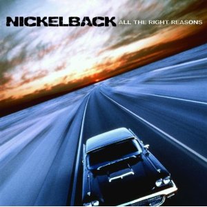
Nickelback – All The Right Reasons (2005)
Hey… look who’s back! It’s Nickelback! For a second time with another “uncool album cover induction” with All The Right Reasons. This marks the second album cover from Nickelback with a highway on it! I can think of a million reasons as to why this album cover is uncool and BORING, here is one: Regardless of the year and make of the automobile shown in the picture, this album cover is nothing more than an auto dealership brochure cover.
30 Seconds To Mars – Self Titled/Debut (2002)
? Doh!
Saving Abel – Self Titled/Debut (2008)
This day and age, I don’t know if I’m looking at a guy or a girl butt here. So, with all the confusion, this album cover is… uncool. For “me” it is anyways. Plus, how many more times do we need the “butt in tight jeans, staring at you in the face” album cover? An exceedingly overdone “theme”.
Bon Jovi – Cross Road (1994)
Just another Bon Jovi “Greatest Hits”. Wow, so compellingly Rockin’… Jon Bon Jovi and his band sitting around in a diner and doing nuthin’. OMG… that is so cool! Yeah, right. In reality, this band would never be caught in a blue collar diner… more like a 10 star, caviar serving, white linen restaurant on Rodeo Drive is more like it. Stone isn’t getting fooled. As an uncool bonus, this photo of the band is washed out and blurry. This photo would receive an “F” grade, back in my photography 101 class in college. This album cover makes Bon Jovi’s “second appearance” on a Metal Odyssey “uncool album cover” list. Congratulations Bon Jovi!
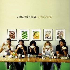
Collective Soul – Afterwords (2007)
Just embarrassing, really. Where is the slight or even remote imagery of “Rock” involved here within this album cover? This is more better suited as a Martha Stewart Living magazine cover. Metal be thy name.
Pearl Jam – Pearl Jam (2006)
I don’t care how many albums were sold of this Pearl Jam release… this is a perfect example of over thinking what your album cover should look like and convey. Trying to go for the “it’s over their heads” mentality doesn’t work for me either, with this album cover. It’s not over Stone’s head, this cover is just 100% uncool. This style of photography and art worked extremely well for Pink Floyd, a legendary band that knew what legendary album covers should look like. Most recently, Pearl Jam is into cartoons on their album cover with Backspacer… go figure.
Judas Priest – Point Of Entry (1981)
Since the day I first bought this Judas Priest album on vinyl, (probably around 1982/83), up until today, this cover just falls flat for me. I absolutely LOVE this album and Judas Priest is a core band for my Metal lovin’ soul. Do I feel guilty then, that I’m choosing a Judas Priest album cover for an “uncool list”? Nope. This “original” album cover for Point Of Entry is so super bland, that it will be forever filed under: What were they thinking? The super scary part about this album cover, is the blue printer paper that stretches on for miles, actually simulates a… highway!!! Even the ultra-legendary Judas Priest dabbled in the highway theme for an album cover! It probably cost $50 in U.S. funds to create this album cover too.
Dokken – Under Lock And Key (1985)
First, Under Lock And Key is a Dokken album that potently Rocks like there is no tomorrow. No, it’s not the hair or fashion that is uncool here. These styles are still utilized by many bands today. This image was an identity to a grand decade of 80’s Hard Rock and Heavy Metal. Instead, what makes this Dokken album cover so uncool is that gigantic, cardboard key. That key ruined it. Minus that key, this album cover never comes up in an uncool album cover conversation. Who was behind this idea? That oversized, concocted, cardboard key would have served better inside a middle school lobby, with the words scrawled upon it: Unlock the key to your child’s education.
Christmas In Your Ear – (Release date unknown and who cares)
Gee Metal whiz, this compilation of Christmas songs, covered by some of the most popular names in Rock history, has not only an uncool album cover, it has an annoyingly uncool album title! Christmas In Your Ear. (!) Metal be thy name. The next uncool thing I’ll uncover will be a cookbook titled: Christmas In Your Stomach. What’s up with the raging serial killer’s face in the Christmas tree ornament? Talk about issues… that dude needs some anger management treatment fast. I could understand the album cover, only if it contained Death Metal bands covering Christmas songs. With the likes of Billy Squire, Red Hot Chili Peppers, The Smithereens and Pat Benatar, etc. on this CD, the cover does NOT fit the contents of what you’ll be listening to. Simply put, an embarrassing album cover and title. I think I’ll change the name of this blog now to: Metal Odyssey In Your Eyes.
METAL BE THY NAME.
LONG LIVE HARD ROCK & HEAVY METAL.
Stone.
Related
This entry was posted on December 12, 2010 at 6:00 pm and is filed under classic rock, Hard Rock, Heavy Metal, humor, metal music, metal odyssey, Music, rock and roll, rock music, rock music news with tags album cover art, foreigner, Hard Rock, Heavy Metal, metal music, metal odyssey, rock album covers, rock music, rock music news, uncool hard rock album covers, uncool heavy metal album covers. You can follow any responses to this entry through the RSS 2.0 feed. You can leave a response, or trackback from your own site.
7 Responses to “Ten Very Uncool Hard Rock And Heavy Metal Album Covers Part III”
Leave a reply to metalodyssey Cancel reply
This site uses Akismet to reduce spam. Learn how your comment data is processed.


December 12, 2010 at 8:34 pm
You couldn’t be farther off the mark with your analysis of Pearl Jam’s avocado cover. Contrary to being over thought and “over their heads”, it was a result of a total lack of interest in trying to impress anyone. When asked what art he wanted for the album, Eddie Vedder responded, “Put a fucking avocado on it for all I care.”
December 13, 2010 at 10:06 am
>Eddie Vedder responded, “Put a fucking avocado on it for all I care.”
To me, that attitude makes it even worse. He couldn’t even be bothered to make an effort for the fans who pay for his album.
But I dislike Pearl Jam and other Grunge bands anyways.
>All of us “Old Schoolers” know the importance of the beloved album cover and realize the album art more often than not parallels the songs heard within.
That’s right. Sometimes you can “judge a book (or album) by it’s cover”.
When I was a kid I used to browse the record store and often choose a new album simply by it’s cover. I “discovered” bands like Dangerous Toys that way.
December 13, 2010 at 10:47 am
I appreciated the “angle” that Erik has come in with, through his comment. It opened up the clear fact that yes, Eddie Vedder has a “who cares” attitude about album covers… based on this story being true and I lean towards that it is. When I wrote this piece, I explained that it was “my” impression that Pearl Jam deliberately had this album cover designed, so as to “go over the fans heads” and the fans would not understand it. In the end, it is very hard to understand!
You are so right about buying those albums long ago based on the artwork! Y&T “Mean Streak” comes to mind right away for me. 🙂
December 14, 2010 at 6:33 am
I am with you with on all of these except Priest. Not great, but I have always liked the landscape and the slightly dated feel. Point of entry is different musicaly and I appreciate that the cover is different too as it’s not the usual metal monster type cover that dominated so many of their albums.
December 14, 2010 at 9:56 am
You make a valid point, Metal Mark. I just don’t understand the idea or theme behind having blue printer paper as a pathway/highway symbol? This arguably could be the most underrated Judas Priest album ever as well. “Point Of Entry” was the second album I bought of theirs, the first being “Screaming For Vengeance”. My third and favorite Judas Priest album I bought… “Stained Class”. I still can’t believe the Priest is embarking on their farewell tour in 2011 either. 😦
December 14, 2010 at 8:01 pm
Say what a farewell tour?!?!?!?! No one told me about this, now I gotta see them live for sure before I miss my chance, first the scorpions now Priest, AHHHH!!!! Not to mention Dio and Heaven and Hell now! What is this world coming to? Oh well hopefully they will come back like KISS and Ozzy Osbourne, and Brian Johnson ahs been threatening of retiring from AC/DC since last year because he felt he was too old, I should have been born earlier!
December 14, 2010 at 8:52 pm
I understand your Metal plight, just know that the flag of Metal gets passed on decade to decade, year to year as well. Great young bands like A7X, Airbourne, Bullet For My Valentine, Gama Bomb, Bonded By Blood and many more will be looked upon one day as the “veterans” of Metal… I just hope I’m still around to see them “retire” too! 😉