TEN VERY UNCOOL HARD ROCK & HEAVY METAL ALBUM COVERS
I don’t advertise myself to be an “expert” in Hard Rock and Heavy Metal album cover design. Nor am I a photography expert either. What I do know is this… a Hard Rock or Heavy Metal album cover should entice fans or potential fans to buy the album. Skulls, flames, guitars, dragons, sword & sorcery, space aliens, monsters and the macabre is right up my Metal alley when it comes to album covers. You won’t find this cool stuff on the album covers below. Marketing Hard Rock and Heavy Metal should be simple, right? Well, that is not always the Metal case, as you shall see from the following list of ten very uncool album covers that I have compiled… just for you.
Years ago, I did earn a degree in Graphic Communications, therefore I think I know what cool Hard Rock and Heavy Metal album artwork is supposed to look like. Then again, what do I know? Some, if not many of the albums in this top ten list have probably sold millions of copies worldwide… so my opinion on these very uncool album covers is probably one big and smelly fart in the wind anyways.
Here are my Top Ten Very Uncool Hard Rock & Heavy Metal Album Covers, enjoy! Or, try to enjoy.
#10:
WHITE LION – BIG GAME (1989)
What this White Lion album cover really is… too many ideas that seemed to collide onto one front cover. You have The White House, some woods, a field and a lion. Wow… very compelling… where is there any darned hint of Hard Rock? Forget about any imagery of Heavy Metal… this entire image makes me want to fall asleep in a field somewhere. This album went Gold too… gee Metal whiz.
#9:
BREAKING BENJAMIN – SO COLD EP (2004)
 Look, if I was to actually read all the jibber jabber on this Breaking Benjamin front cover, It would give me a migraine headache . The album cover eludes to So Cold being a “spoken word” EP for Metal sakes. I always thought tons of text was supposed to be found in the damned liner notes anyways. Despite this being an EP, it makes my list… so Metal be it.
#8:
MR. BIG – BUMP AHEAD (1993)
Ha, ha, hee. Was I supposed to laugh? Ahhhhhhh! Am I supposed to be frightened? What is this enormous man-head doing in the middle of a busy city street? Just another fine example of a genius and artsy idea gone astray. I can’t find any hidden and profound message in this album cover art either. Some linkage to Mr. Big being tied into Hard Rock and commercial Heavy Metal would have helped here.
#7:
BON JOVI – LOST HIGHWAY (2007)
Gosh, just what I need to look at… some strangers cluttered dashboard. No semblance of Rock ‘N’ Roll in this front cover pic. Lost Highway is a perfect title for this Bon Jovi album… for the art direction became totally lost in the creation of this album cover. Plus, as a bonus… it is IMPOSSIBLE for a highway to become lost! Grammatically incorrect alert!! Yeah, yeah, yeah… Bon Jovi gets the last laugh here, due to his selling a million albums a month. This cover still stinks though.
#6:
SAXON – INNOCENCE IS NO EXCUSE (1985)
What appears to be a teenaged girl eating an apple… well, it’s not cool. What’s the point? It’s NOT Heavy Metal either. Adding the Saxon logo that’s carved into the apple is just plain ridiculous too. This Saxon album cover does not advertise head banging music heard within at all. A superiorly unimpressive album cover from a band that I really, really like… what a Metal shame.
#5:
VIXEN – LIVE & LEARN (2006)
Whoa! This Vixen album cover just SCREAMS Heavy Metal! Look out! Vixen looks so thrilled doing this cover shot too. Sorry, I don’t buy the connection of the front cover photo to the album title either. This album cover is simply boring and boring again. Did I mention it was boring?
#4:
KILLER DWARFS – BIG DEAL (1988)
Um, uh, yup.
#3:
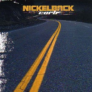
NICKELBACK – CURB (2002 reissue alternate cover)
Well, at least we now know where Bon Jovi got his inspiration for the anti-amazing Lost Highway album cover. If I am not mistaken, this road really needs some traffic… and Curb really needs a new album cover.
#2:
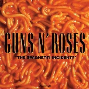
GUNS N’ ROSES – “THE SPAGHETTI INCIDENT?” (1993)
This Guns N’ Roses album cover does not make me yearn for opening and eating a can of Spaghettio’s. I actually lose my appetite for half a day each time I stare at this album cover. I’d rather look at any and all of the Cannibal Corpse album covers before I look at this disgustingly stale spaghetti on this album cover. Again, I am so wowed at the Hard Rock and Heavy Metal imagery found here.
#1:
AEROSMITH – GET A GRIP (1993)
Voila! Here it is! What I consider to be the upmost in uncool… an F’n pierced cow udder. This is so Rock ‘N’ Roll. NOT. The fake Aerosmith branding into the side of this cow only makes matters worse. What were everyone involved with creating this album cover thinking? Yeah… just as the album title states, the culprits involved in the decision making of this extremely uncool album cover should… get a grip.
Stone.
Related
This entry was posted on May 1, 2010 at 2:27 am and is filed under album covers, Hard Rock, hard rock albums, hard rock bands, hard rock music, Heavy Metal, heavy metal albums, heavy metal bands, heavy metal music, humor, lists, metal odyssey, Music, rock & roll, rock 'n' roll, rock and roll, rock music with tags 1980's hard rock bands, 1980's heavy metal bands, 1990's heavy metal bands, 1990's hard rock bands, hard rock album covers, hard rock music, Heavy Metal, heavy metal album covers, heavy metal bands, heavy metal music, metal odyssey, Music, nwobhm, rock music, top ten uncool hard rock album covers, top ten uncool heavy metal album covers. You can follow any responses to this entry through the RSS 2.0 feed. You can leave a response, or trackback from your own site.
15 Responses to “TEN VERY UNCOOL HARD ROCK & HEAVY METAL ALBUM COVERS”
Leave a reply to metalodyssey Cancel reply
This site uses Akismet to reduce spam. Learn how your comment data is processed.


May 1, 2010 at 4:33 am
I think Mr. Big “Bump Ahead” is trying for a play on words (bump a head)…they also have “Hey Man” with a “hay-man” on the cover.
I’m not much of a Mr. Big fan…but they’re popular in Japan. They released many Live In Japan and “for Japan only” albums. And Paul Gilbert’s wife is Japanese. He lived in Tokyo for a few years.
Anyways, this is an interesting idea for a blog post.
I think the worst album cover is the original cover art for the Scorpions “Virgin Killer” with the undressed and under-aged girl on the cover.
Often I don’t understand why some rock covers get banned and re-released with new artwork in America…but in this album’s case, I understand and support the re-released cover fully.
I find the original cover totally inappropriate!
May 1, 2010 at 1:27 pm
I agree with you on all these except the Saxon one. Okay they have a lot better covers, but I liked this one too. It might have helped that I was teenage boy when I first saw it though.
May 1, 2010 at 5:54 pm
I think that is it… the “older” I get, the more this girl looks younger to me. Still, what does eating an apple have to do with the album title “innocence Is No Excuse”? Maybe the imagery of eating an apple linked to the “Adam & Eve” bible story?
It’s just this album cover doesn’t scream Saxon to me… a far cry from the “Denim and Leather” persona!
May 1, 2010 at 7:28 pm
I always assumed it was the Adam and Eve link.
May 2, 2010 at 11:16 pm
I would have to say Kiss “Asylum as my #1 least favorite metal album cover of all time!! Looks kinda of girly to me!
May 3, 2010 at 12:33 am
I’d say Poison’s “Look What The Cat Dragged In” is much more ‘girly’ than any KISS album cover.
The worst album covers, in my opinion:
Scorpions “Virgin Killer” (as the mentioned above),
Jackyl “Cut The Crap”
Alice Cooper “Hey Stoopid”
Rolling Stones “Sticky Fingers”
King Kobra “Thrill Of A Lifetime”
RATT “Dancing Undercover”
Pantera “Metal Magic”
May 3, 2010 at 12:21 pm
KISS “Animalize” is kinds boring and furry too. It’s like looking at a cheap purse you can buy on Canal Street in NYC.
May 3, 2010 at 12:41 pm
That’s true.
“Animalize” and “The Elder” are the worst cover art in the KISS catalog, in my opinion.
May 3, 2010 at 12:58 pm
I love KISS, yet, “Animalize” and “The Elder” were missing “that” KISS mystique… IMO. I’m glad I’m not the only one who thinks this way… then again, it’s art and beauty is in the eye of the beholder!
Stone
May 3, 2010 at 1:01 pm
I”m referring to the album cover art when using the words… “missing that KISS mystique”.
The music is a whole other topic!
Stone
May 4, 2010 at 10:58 pm
The Poison album cover is not Girly it’s “Glamorous”
May 5, 2010 at 9:29 am
Glamourous is still girly.
December 3, 2010 at 9:59 am
>AEROSMITH – GET A GRIP
Speaking of Aeromsith…have you heard Steven Tyler’s solo song that he did for a movie here in Japan?
December 3, 2010 at 10:25 am
I have not heard it… is it a “new” song too? I just really, really, dig the early Aerosmith albums. I like the “commercial” Aerosmith of the late 80’s and 90’s too, only that 70’s “sound” and “vibe” Aerosmith had in their earlier years is soooo Classic! Steven Tyler is like the “Eveready battery in that toy bunny” (commercial)… he takes a licking and keeps on ticking!!
– Stone
May 6, 2015 at 10:48 am
My ears are blind to the album cover art work. I do respect your opinion, but heavy metal has never been about being what “you’re supposed to” anything! It’s hard, it’s raw, it’s rebellious! I’ve never said no because the album cover wasn’t my taste.